UI/UX Interface
Load Board
Project details
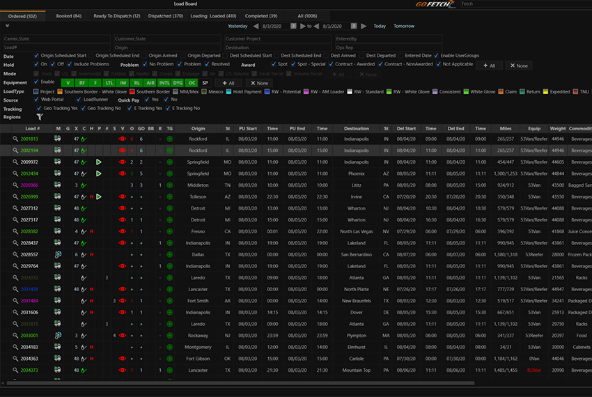
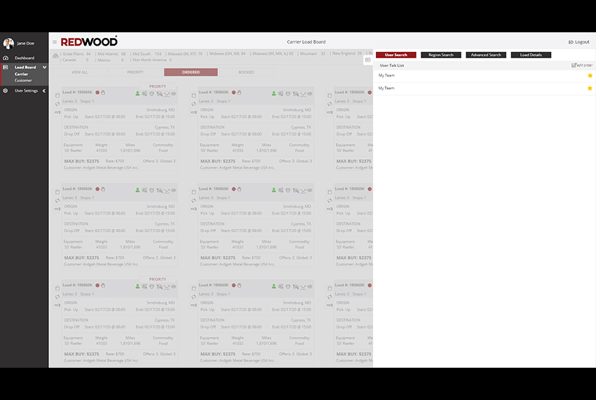
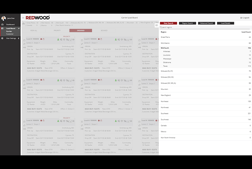
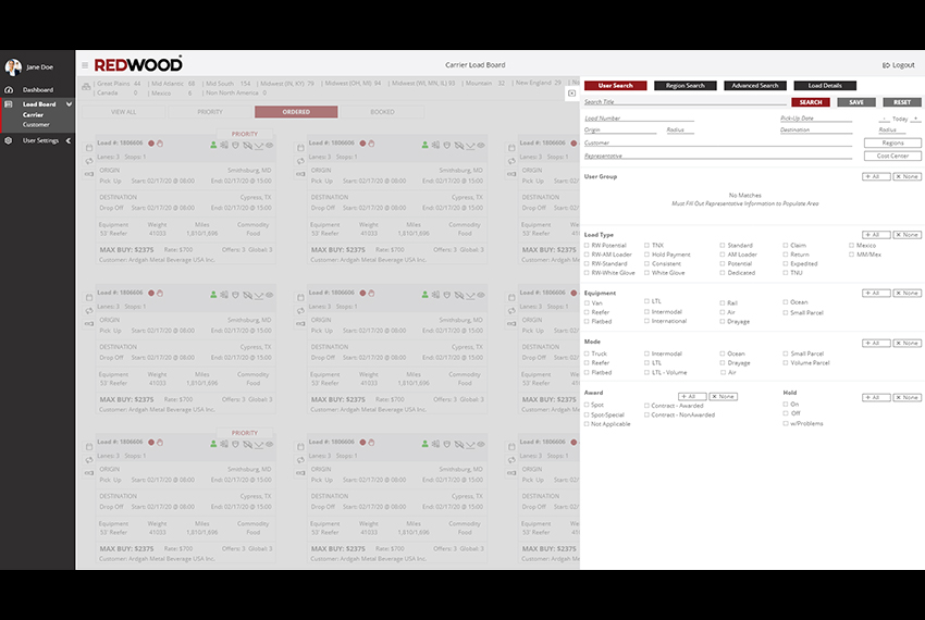
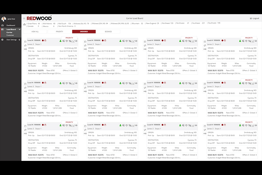
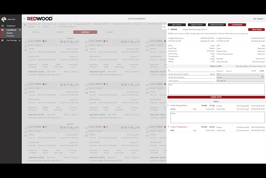
The most integral part of a 3PL is the ability to see and book potential loads with ease. The Carrier Representatives spend most of their time searching for freight that their prospective clients can haul for customers. As the old system, a desktop-based application needed to be updated for the web, it became necessary to reimagine 40+ columns originally laid out like an Excel spreadsheet for a more responsive web-based application. The final mock set provided showcases the reimagined columns as easy to read cards with informational icons that users can scan quickly and identify problems, status, cost and other load identifying features.
Team Involved: Designer (myself)
Product Owner: Carrier Sales Manager
Stakeholders: CEO, CIO, VP of Operations, Director of IT, Application Development Manager
My Role: As the UI/UX Lead, I interviewed internal users to understand their needs and what would help make their work easier. I also worked with the stakeholders to create the user journeys, user personas, wireframes, and mocks. Finally, I led a small design team and guided the development team to understand workflow patterns from the mocks.
-
Category :
Design Interface
-
Usage :
Internal Load Board
-
Technology :
Adobe XD
Visualization
The lifeblood of the company, the Load Board was a small part of the internal proprietary software used by everyone at Strive, and later Redwood. Unfortunately, the current internal system was also a 15-year-old desktop application could take upwards of 10 seconds to load information. The Load Board was not tailored to specific user experiences and instead attempted to appease all users who needed to use the board, such as Carrier and Customer teams, as well as managers. An Excel spreadsheet style with filtering, 40+ columns with a side scroll, plus a details panel, there was no color usage strategy. Stakeholders would make demands for color coding, leading to confusion as the 30+ color scheme was used multiple times for different items.
My solution was to create two different Load Boards, focusing on individual team needs between Customer and Carrier departments. Focusing on Carriers teams first, I could remove information that was irrelevant to Carrier Sales and Carrier reps. I wanted to make colors extremely meaningful on the new Load Board and removed a lot of the previous colors, only inserting color as indicators, for things like issues, temperature controls, or hazmat loads. Deciding on a grid-like card system rather than Excel rows, we chose this design because most of the internal users were in the 20-30s range and found it was easier to process information easily without compromising the amount of information needed to be displayed. Finally, we made the decision to move the Load Board framework from a desktop application to a web application hosted on AWS.
Goals
There were several goals for the Load Board overhaul. The first goal was to reduce the amount of time spent waiting for the application to load. Our target was to have the load board take up to 3 seconds at most for load time. The second goal was to reduce the number of columns and need for side-scrolling, as we found users rarely side-scrolled and used the details panel if they needed to view more information. The third was to reduce training time on the load board by making the experience more intuitive to a user.
Limitations and Constraints
Most of the constraints were from the Stakeholders, as different departments wanted different things and all of them had varying opinions on how to reach a consensus. Ultimately, a lot of negotiation between the stakeholders, backed by the user research was used to convince the stakeholders that what they wanted wasn't necessarily in the best interests of the user, which were their own employees. One of the methods used to convince stakeholders to reduce the steps involved in freight management was taking into account a work-around users created for themselves. Internal employees would book freight for their clients by copying themselves on emails and accepting load requests -- a process originally designed for external use, but became popular to use internally as it was faster than using the load board.
Results
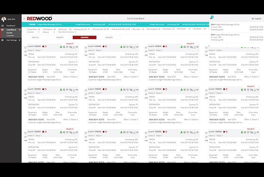
With the move to AWS and hosting the board on the web instead of as a desktop application, we were able to reduce the load time experienced by users. We also gave the users a better experience overall by allowing them to submit freight offers on one panel without the need for multiple steps. We also created an alert system that would reduce email noise for the users.

